The Duality of Craft: A Heritage Analysis of the Orchid Pavilion and Geese among Reeds Screens
Introduction: The Artifact as a Testament to Material Mastery
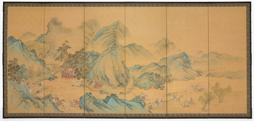
In the rarefied world of heritage textiles and decorative arts, few objects command the same reverence as a pair of six-panel screens that marry the intellectual profundity of classical Chinese calligraphy with the ephemeral beauty of avian life. This artifact, a pair of six-panel screens executed in ink, colors, and gold on silk on the front, and ink and silver on paper on the back, represents a pinnacle of classic silk craftsmanship and fluid elegance. The front panel depicts The Gathering at the Orchid Pavilion, a seminal moment in literary history, while the reverse features Geese among Reeds, a tranquil scene of natural observation. As a Senior Heritage Specialist at the Lauren Fashion Heritage Lab, I approach this object not merely as a decorative piece, but as a sophisticated dialogue between materiality, narrative, and technique—a dialogue that resonates deeply with the principles of precision, restraint, and artistry upheld on London’s Savile Row.
Materiality: Silk as the Canvas of Imperial Prestige
The choice of silk for the front panels is no accident. Silk, in the context of Chinese heritage, is a material of immense cultural and economic significance. Its production, from the cultivation of silkworms to the weaving of fine threads, was a closely guarded imperial secret for millennia. Here, the silk serves as a luminous substrate for the ink, colors, and gold that bring the Orchid Pavilion gathering to life. The gold, applied with meticulous precision, catches ambient light, creating a shimmering effect that elevates the scene from mere illustration to a sacred commemoration. This is not unlike the way a Savile Row tailor selects a Super 150s wool or a silk lining for a bespoke suit—the material itself dictates the garment’s drape, breathability, and longevity. The silk on these screens is similarly chosen for its ability to absorb and reflect pigment, to hold the weight of gold leaf without buckling, and to endure centuries of environmental fluctuation.
The reverse, executed in ink and silver on paper, offers a deliberate counterpoint. Paper, while less durable than silk, allows for a different kind of expression: the ink can bleed and feather, creating soft gradations that mimic the misty reeds and the subtle plumage of geese. The silver, unlike gold, tarnishes over time, introducing an element of organic change. This duality—the permanence of gold on silk versus the evolving patina of silver on paper—mirrors the philosophical tension between the timeless ideals of the Orchid Pavilion and the transient beauty of the natural world. In Savile Row terms, this is akin to the contrast between a worsted wool suit (structured, formal, enduring) and a linen jacket (relaxed, breathable, responsive to wear). Both are masterful, but they speak to different contexts and temperaments.
Narrative and Technique: The Orchid Pavilion Gathering
The front panel depicts The Gathering at the Orchid Pavilion, an event immortalized by the calligrapher Wang Xizhi in 353 AD. The scene shows scholars, poets, and artists engaged in a “winding stream” drinking game, composing verses as cups float down a meandering brook. The composition is dense yet fluid: figures are arranged in clusters, their robes rendered in delicate washes of color, while the landscape—rocky outcrops, bamboo groves, and the titular pavilion—is delineated with confident brushstrokes. The gold accents are reserved for the most important elements: the pavilion’s roof, the cups, and the calligraphic inscriptions that punctuate the scene. This selective use of precious metal is a technique known as kinpaku in Japanese screen painting, but here it is executed with Chinese restraint. The gold does not overwhelm; it punctuates, guiding the viewer’s eye through the narrative.
From a technical standpoint, the application of ink and colors on silk requires a steady hand and a deep understanding of the medium. Silk is less absorbent than paper, so pigments sit on the surface rather than sinking in. This allows for layering—a technique called gongbi (meticulous brushwork)—where multiple thin washes build depth and luminosity. The artist must work quickly, as silk dries unevenly, and any hesitation can result in blotches. This is analogous to the Savile Row tailor’s approach to a hand-stitched lapel: each stitch must be precise, consistent, and invisible to the untrained eye. The result is a surface that appears effortless but is, in fact, the product of rigorous discipline.
The Reverse: Geese among Reeds and the Art of Observation
Turning to the reverse, Geese among Reeds offers a study in contrast. The scene is spare: a few geese wading through shallow water, their necks curved in elegant arcs, while reeds bend under an unseen breeze. The ink is applied in varying dilutions—thick for the geese’s beaks and legs, thin for the water and sky. The silver is used sparingly, perhaps to highlight the water’s surface or the geese’s iridescent feathers. Over time, the silver will oxidize, darkening to a soft grey or black. This is not a flaw but a feature: the screen is designed to age gracefully, its beauty evolving with the passage of years. In the context of Savile Row, this is reminiscent of a well-worn tweed jacket that develops a patina through exposure to rain and sunlight, or a pair of oxford shoes that mold to the wearer’s feet. The object is not static; it lives.
The juxtaposition of the two sides—one a bustling social scene, the other a quiet natural vignette—creates a dialectic. The front speaks to human connection, intellectual pursuit, and the desire to immortalize a moment. The reverse speaks to solitude, observation, and the acceptance of impermanence. Together, they form a complete philosophical statement, one that resonates with the Confucian ideal of harmony between humanity and nature. For a heritage brand like Lauren, this duality offers a rich narrative: the front is the public face, the polished presentation; the reverse is the private self, the quiet craftsmanship that supports the whole.
Conclusion: A Legacy of Fluid Elegance
This pair of six-panel screens is more than a decorative object; it is a masterclass in materiality, narrative, and technique. The silk front, with its gold and colors, captures the grandeur of a literary tradition; the paper reverse, with its ink and silver, captures the subtlety of the natural world. Together, they exemplify the fluid elegance that defines the best of Chinese decorative arts. For the Lauren Fashion Heritage Lab, this artifact serves as a reminder that true luxury lies not in ostentation but in the thoughtful integration of material, skill, and story. It is a lesson that Savile Row, with its bespoke suits and hand-finished details, has long understood: the finest creations are those that honor their materials, their makers, and their audience.